 Noida
Noida Netherlands
 USA
USA

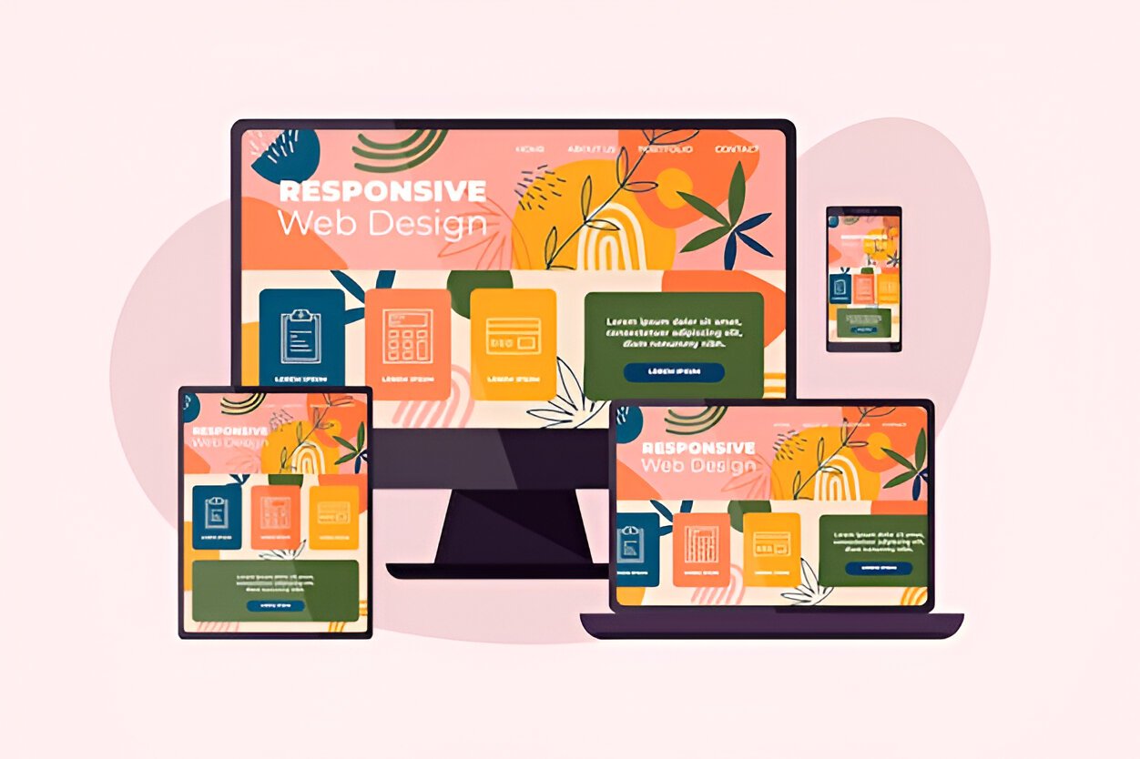
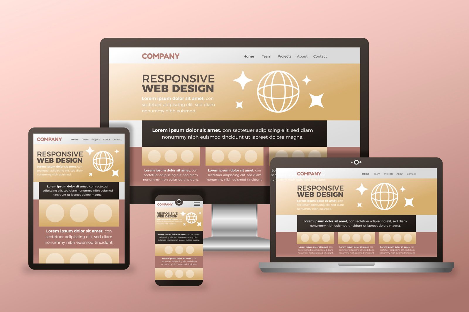
Responsive Web Design for
All Screen Sizes.
At Techventers, we specialize in crafting responsive websites that automatically adapt to any device—whether it’s a desktop, tablet, or smartphone. In today’s digital-first world, your website must deliver a flawless experience across platforms to keep users engaged. Our design approach is rooted in mobile-first principles, ensuring fast load times, intuitive navigation, and clean visuals that work smoothly on all screen dimensions. We don’t just shrink content—we restructure and optimize it to create a consistent and enjoyable journey for every visitor.
Responsive design is more than just aesthetics; it’s about delivering results. A well-optimized, device-friendly site enhances user satisfaction, boosts SEO performance, and increases conversions. At Techventers, we combine innovative design thinking with the latest technologies to build websites that are both beautiful and high-performing. Whether you’re launching a new site or upgrading your current one, our responsive web design services ensure your digital presence is future-ready, impactful, and built to scale.
Responsive Design Solutions for
Seamless User Experience.
95% of users leave a site if it isn’t mobile-friendly—our responsive designs ensure you never lose a visitor.
80% of internet traffic comes from mobile devices—Techventers helps you stay ahead with mobile-first web solutions.
70% of online users are unlikely to return to a site after a bad experience—our responsive designs are built to impress from first click.
"Expert Responsive Web Design Services to Optimize User Experience Across All Devices"
At Techventers, we deliver responsive web design solutions that ensure your website performs seamlessly across every screen—be it desktop, tablet, or mobile. Our service goes beyond just resizing content; we focus on creating fully adaptive layouts that maintain functionality, design consistency, and performance regardless of device or resolution. From mobile-first strategy and flexible grid systems to fast-loading frameworks and intuitive user interfaces, every element is crafted to deliver a smooth and engaging experience.
Designing Seamless Mobile-First Experiences for the Next Generation of Users
At Techventers, we begin every project with a mobile-first design philosophy, ensuring that your website caters effectively to the vast majority of users accessing the web through smartphones and tablets. Our layouts are optimized for touch interactions, vertical scrolling, and quick loading, which creates a highly engaging experience from the first click. We build upward from mobile to ensure that the site performs flawlessly on tablets and desktops without compromising on usability or speed.
Building Flexible, Adaptive Layouts That Perform Across All Screen Sizes
Our responsive layouts adjust fluidly to various screen sizes, making your website look and function beautifully on devices of all types—mobile, tablet, laptop, or desktop. We use a grid-based system, scalable images, and flexible media queries to ensure content is always displayed in the most accessible and visually appealing way, increasing both user satisfaction and engagement.
Ensuring Consistent User Experience Through Cross-Browser Compatibility
In a multi-browser world, consistency is key. At Techventers, we rigorously test your responsive website across all major browsers including Chrome, Firefox, Safari, Edge, and Opera. Whether your visitors come from desktop or mobile environments, we guarantee a unified look and feel, eliminating design discrepancies that can harm credibility and user trust.
Improving Website Speed, Performance, and Overall Load Time
Speed is crucial—not just for user experience but also for SEO rankings. Our responsive web designs are engineered with performance in mind. We minimize HTTP requests, compress assets, implement caching strategies, and ensure code cleanliness. The result is a high-performing site that loads quickly, even on slower mobile networks, keeping your bounce rates low and engagement high.
Creating Custom User Interfaces that Reflect Your Unique Brand Identity
Every business has a unique story to tell. That’s why our team crafts custom UI/UX designs that go beyond generic templates. We incorporate your brand’s colors, typography, voice, and vision into the website’s core structure. The result is an immersive, responsive web experience that aligns perfectly with your brand’s personality and business goals.
Developing Future-Ready and Easily Scalable Digital Platforms
As your business evolves, so should your website. Techventers builds with future growth in mind—whether you want to add new service pages, integrate third-party tools, or expand globally. Our responsive designs are built on scalable, flexible frameworks, so your site remains agile and adaptable for whatever comes next.
Delivering End-to-End Responsive Web Design Solutions With Full Support
From strategy and design to development and post-launch support, Techventers offers a complete responsive web design service. We collaborate with your team at every step to ensure alignment with your goals, timelines, and expectations. Our job doesn’t end at launch—we remain your digital partner to ensure your site stays updated, optimized, and ahead of the curve.
Key Features That Make Our Responsive Web Designs
Stand Out Across Every Device.
At Techventers, our responsive web design services are built with performance, adaptability, and user experience at their core. We integrate fluid grid systems, flexible images, and smart CSS media queries to ensure your website responds flawlessly to any screen size or orientation. Whether a user visits from a mobile phone, tablet, laptop, or desktop, the experience remains consistent, intuitive, and visually appealing. We also focus on lightweight code, fast loading times, SEO-friendly architecture, and device-specific optimizations that not only enhance usability but also improve your search rankings. Every feature is thoughtfully engineered to support your business goals and provide users with a seamless digital journey from start to finish.
Adaptive Design Across All Devices
• Intuitive flow regardless of screen orientation.
• No horizontal scrolling or content clipping.
• Optimized for portrait and landscape modes.
• Maintains branding consistency across viewports.
• Automatically adjusts fonts, images, and grids.
Mobile-First Development Approach
• Prioritized content hierarchy for smaller screens.
• Lightweight mobile assets for fast loading.
• Responsive touch-friendly elements.
• Minimalist layout for mobile clarity.
• Progressive enhancement for larger devices.
Flexible Grid and Layout Systems
• Column-based layouts that shift responsively.
• Content stack order managed via CSS Grid/Flexbox.
• Retains visual balance on all screen widths.
• Ensures design alignment and proportionality.
• Simplified future content expansion.
Cross-Browser and Platform Compatibility
• Unified appearance across browser engines.
• Handles old browser fallbacks gracefully.
• Smooth rendering in modern web environments.
• Reduces bugs across devices and OS versions.
• Validated using W3C standards.
Would you like to increase your ranking now?
Reach out to our expert SEO consultant to discuss how SEO
Solutions can help you achieve your goals.
Advantages of Choosing Responsive Design
with Techventers.
Responsive web design is no longer optional — it’s essential for businesses that want to stay competitive in the digital world. At Techventers, we focus on crafting responsive websites that adapt fluidly to any screen size, ensuring your visitors enjoy a seamless and consistent experience whether they’re browsing on a mobile phone, tablet, or desktop. A responsive site reduces bounce rates, increases time on site, and improves search engine rankings due to mobile-friendliness. Moreover, it eliminates the need for multiple versions of your website, cutting down development and maintenance costs. With Techventers, you get a site that not only looks great but works flawlessly everywhere — giving your brand the reach and impact it truly deserves.
Seamless User Experience Across All Devices
Techventers designs responsive websites that automatically adapt to any screen size—mobile, tablet, or desktop. This ensures a consistent user experience regardless of the device being used. Visitors don’t need to zoom or scroll excessively to find content. Everything is perfectly aligned and accessible. The result is higher user satisfaction and longer engagement.
Improved SEO and Search Visibility
Responsive design is not just about appearance—it directly impacts your SEO. Search engines favor mobile-friendly websites, helping your site rank higher. Techventers uses clean code and fast-loading layouts to meet modern SEO standards. With better rankings comes more organic traffic and potential leads. Your site becomes easier to find and trust.
Cost-Effective Maintenance and Scalability
With one responsive site instead of multiple versions, you save both time and money. Updates and content changes need to be done only once, reducing workload. This also ensures consistent branding and functionality across platforms. Techventers builds scalable designs that grow with your business. You invest once for long-term performance.
Faster Loading Speeds on All Devices
Site speed is crucial for retaining visitors, especially on mobile networks. We optimize every element—images, scripts, and layouts—to deliver quick load times. Faster sites improve user retention, reduce bounce rates, and enhance conversions. Techventers ensures that your site loads smoothly regardless of device or internet speed. Speed equals success.
Higher Conversions and Better ROI
A responsive design leads to smoother navigation, clearer calls-to-action, and fewer user drop-offs. Techventers focuses on converting visitors into customers through intuitive layout and design. The more effortless the experience, the more likely users are to engage. Whether it’s sign-ups or sales, responsive design drives results. Your ROI improves steadily.
Future-Ready Web Design Technology
Technology evolves, and your website should too. Our responsive designs are built with future adaptability in mind. Whether it’s new devices or browser updates, your site will remain modern and functional. Techventers follows best practices and uses forward-compatible frameworks. This makes your website future-proof and reliable for years to come.
Professional Responsive Design with
Full-Service Expertise.
At Techventers, we specialize in crafting responsive websites that offer flawless experiences across all devices. Our team blends design precision with technical excellence to ensure your site adapts beautifully to mobile phones, tablets, laptops, and desktops. From wireframing to deployment, we focus on user behavior and device adaptability to build layouts that are intuitive, fast-loading, and visually consistent. With a mobile-first approach and deep knowledge of UX best practices, we help brands stay relevant in today’s multi-device digital world.
Beyond design, our expertise extends into performance optimization, accessibility compliance, and SEO integration—ensuring that your site not only looks great but also ranks well and reaches your audience effectively. Whether it’s a new project or a redesign, Techventers delivers end-to-end responsive web design services that are scalable, secure, and tailored to meet your business goals. We are committed to helping you build a digital presence that engages users, enhances credibility, and drives growth.
Diverse Responsive Web Design Services to
Fit Every Need
At Techventers, we offer a full spectrum of responsive web design services tailored to meet your specific business goals. Whether you need a sleek corporate site, an eCommerce platform, or a custom landing page, we ensure every design is mobile-optimized, accessible, and aligned with your brand identity. Our design team uses industry-leading frameworks and best practices to deliver layouts that respond seamlessly to screen variations, providing an uninterrupted experience for every user.
Don’t wait for!!
From static responsive websites to dynamic CMS-based platforms, our services cover everything from planning and prototyping to final deployment. We focus on creating performance-driven, SEO-friendly, and user-focused websites that not only adapt to devices but also enhance engagement, reduce bounce rates, and drive conversions. With Techventers, you get design solutions that grow with your business and scale with user demand.
Here’s why companies
love working with Techventers

Techventers has developed a highly-interactive website for us. The highly-skilled professionals initially conducted a kick-off meeting and proposed a concept. The team's management style and communication were prompt, professional, and responsive.
Stas Kogen

Techventers has developed a highly-interactive website for us. The highly-skilled professionals initially conducted a kick-off meeting and proposed a concept. The team's management style and communication were prompt, professional, and responsive.
Stas Kogen
